Care.com Search Redesign
Care is the world’s leading platform for finding and managing high-quality family care.
At Care, I lead design for the Search & Match experience across both sides of the marketplace. This is our core product and one of the most critical surfaces for connecting families with caregivers.
Project
Search Redesign
Impact
+27 in NPS, +10% Click-to-contact, +14% Customer Effort Score
Problem
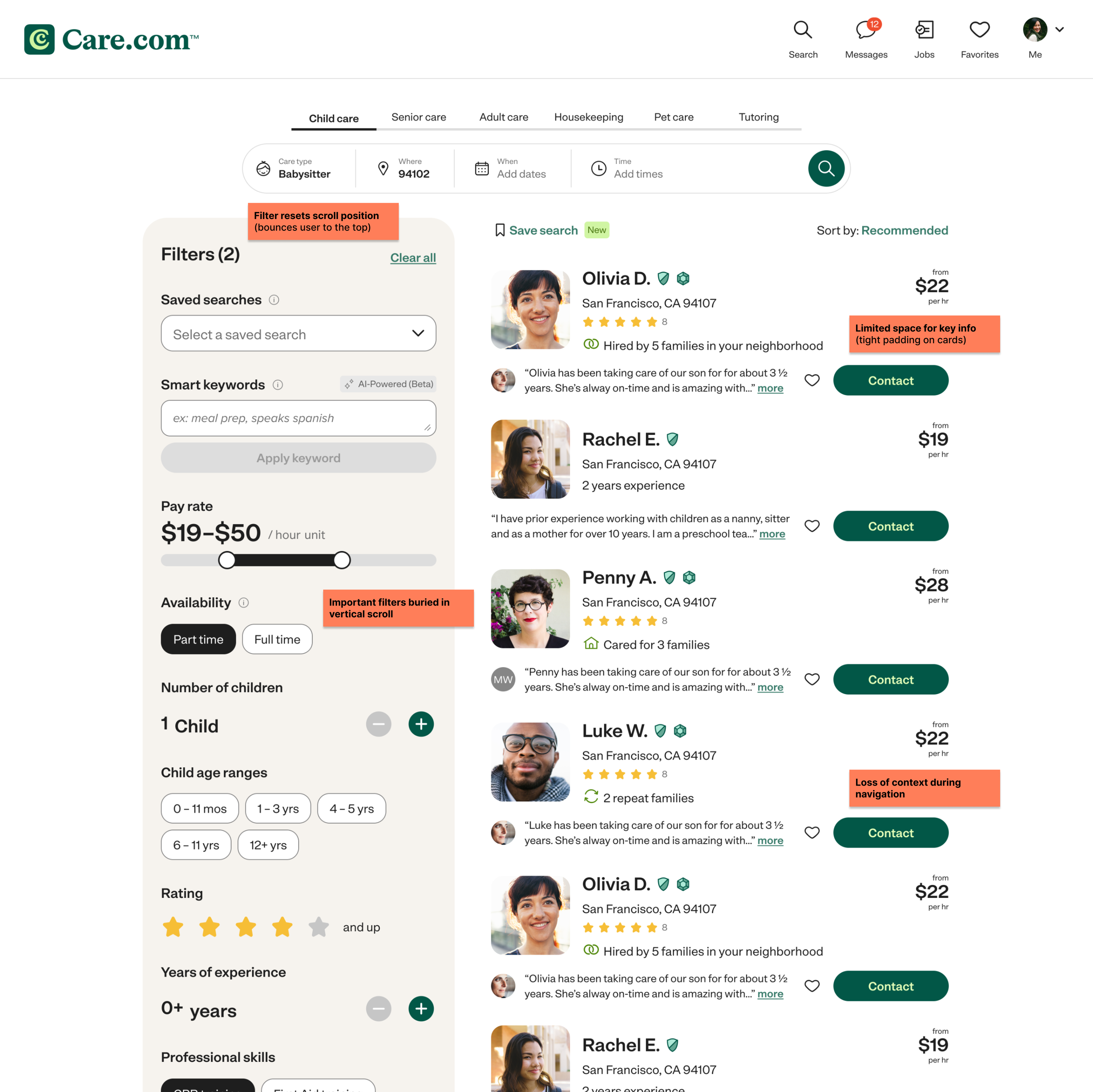
Search was functionally complete, but not usable at scale. Filters were positioned vertically on the left, and each interaction triggered a disruptive “bounce” that reset users to the top of the page.
This created a compounding effect:
Users lost their place while refining results
Filtering felt unpredictable and frustrating
Drop-off increased at a key conversion point
Search was inefficient and actively eroding user confidence in finding caregivers.
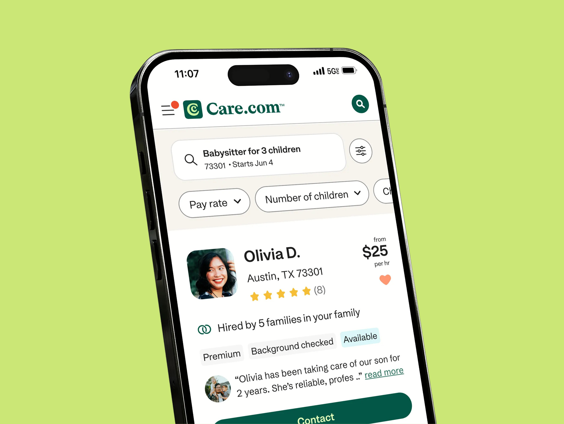
Old UI
Spanning desktop, mobile web, IOS, and Android
Annotation of issues
Core friction points impacting search and decision making
Role and goals
I owned the end-to-end redesign of search filtering, working closely with product and engineering to balance user needs with technical constraints.
Goals
Improve filter usability and efficiency
Increase click-to-contact conversion
Reduce friction and improve decision confidence
Research
I started by grounding the problem in real behavior:
Analyzed how users were interacting with filters through heat maps and Amplitude analytics
Identified which filters mattered most
Mapped friction points across the search journey
Alongside user research, I benchmarked industry patterns to uncover gaps in our experience and align with user expectations.
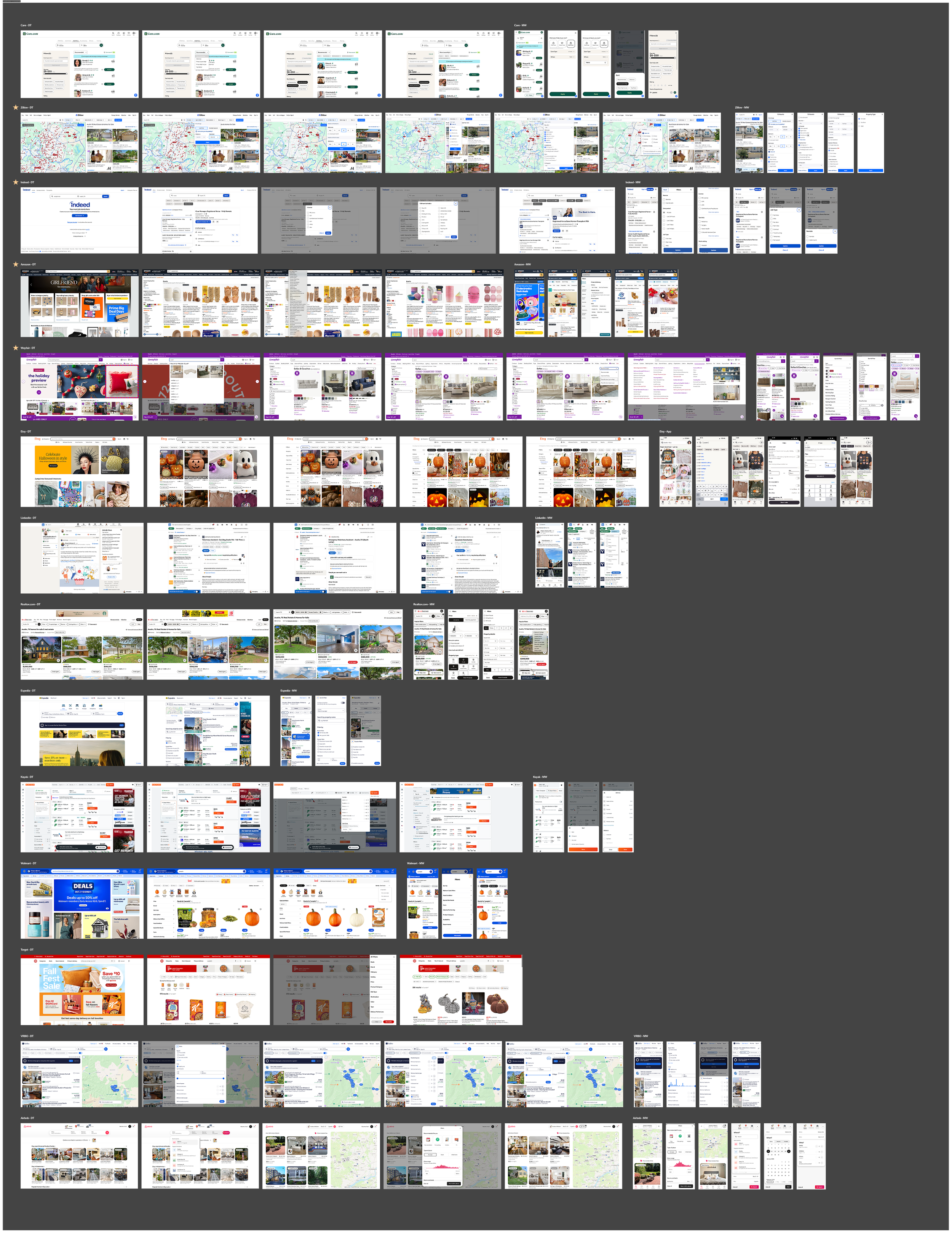
Competitive analysis
Analyzed competitor products and industry best practices to identify UX patterns and opportunities
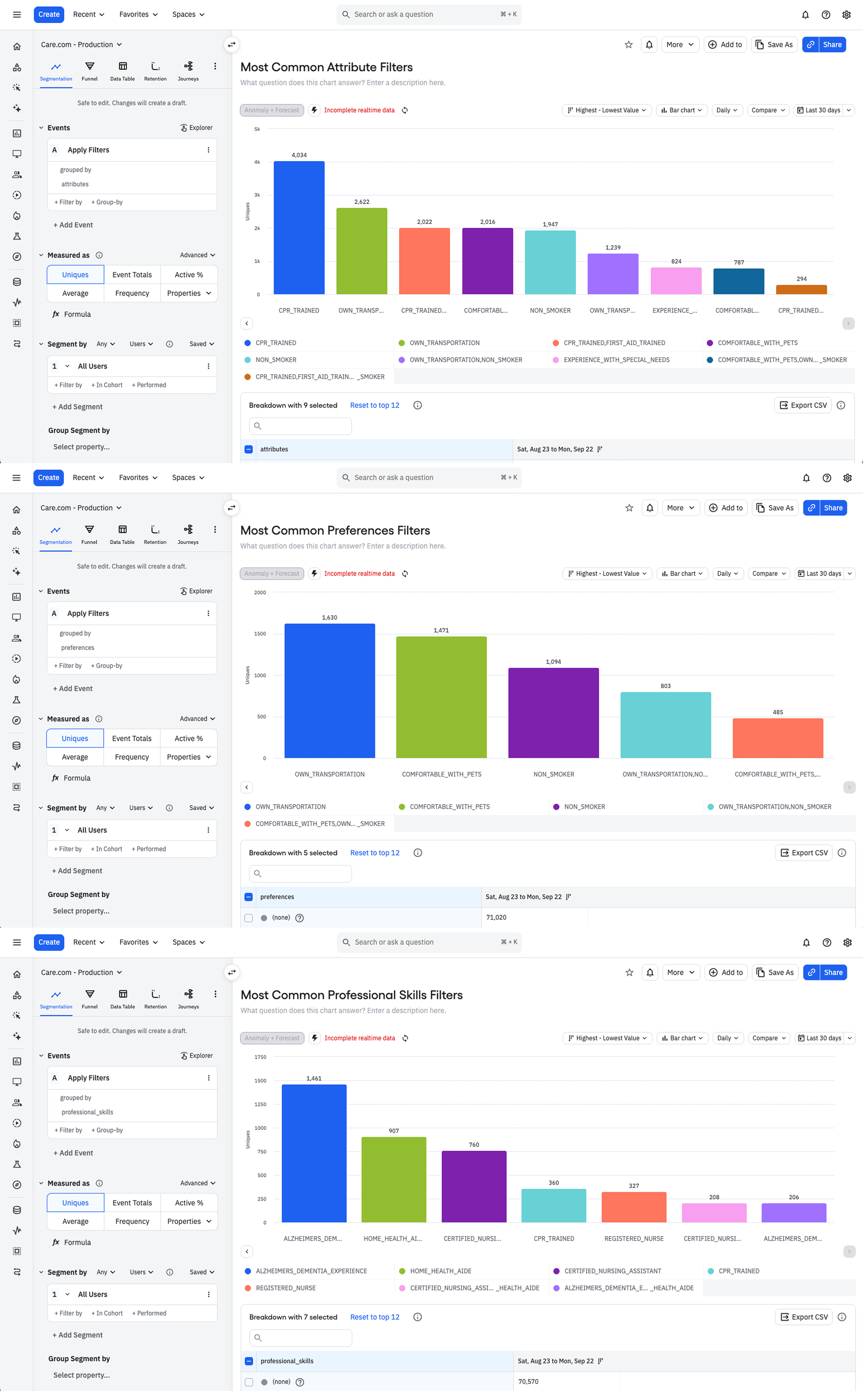
Data analysis
Used Amplitude to evaluate filtering behavior and identify friction points in user flows
Key findings
1
Filter interactions disrupted the browsing flowApplying filters reset scroll position and context, causing users to lose their place and repeat actions.
2
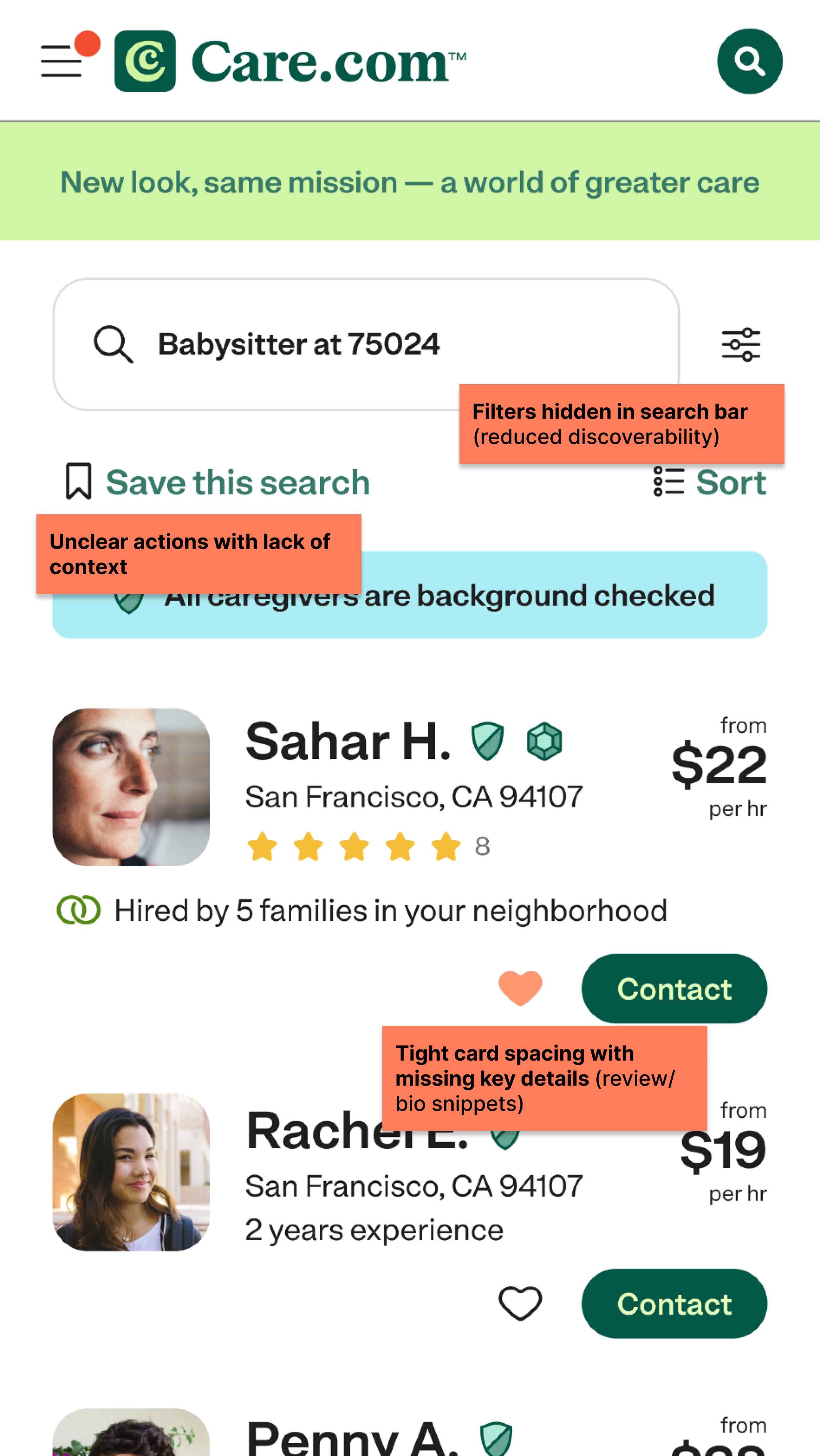
Important information was difficult to findCritical filters such as child age and required skills were hidden below the fold, forcing users to scroll to and dig to find these options.
3
Users lacked confidence when selecting a matchCard layout limited visibility of key details, forcing users to click into profiles to trust decisions and take action.
Design process
I approached this work as a continuous cycle of exploration, validation, and refinement. I partnered closely with product and engineering to align on constraints and solutions, and used weekly design reviews to pressure test my ideas early and often.
Rather than designing in isolation, I brought work into the open quickly. I believe sharing work early and gathering feedback helps to build alignment and generate momentum across the team and stakeholder groups. This approach allowed me to move quickly, stay coordinated, and continuously improve the experience with each iteration.
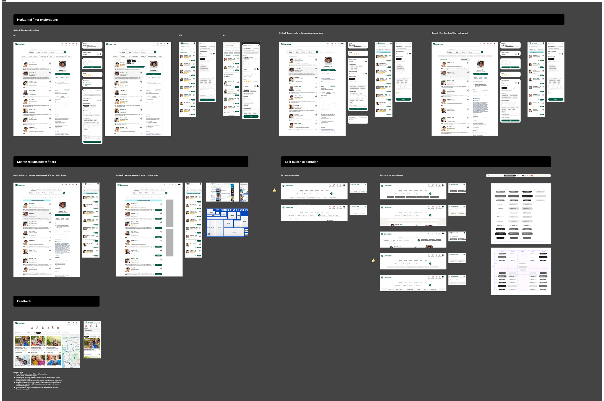
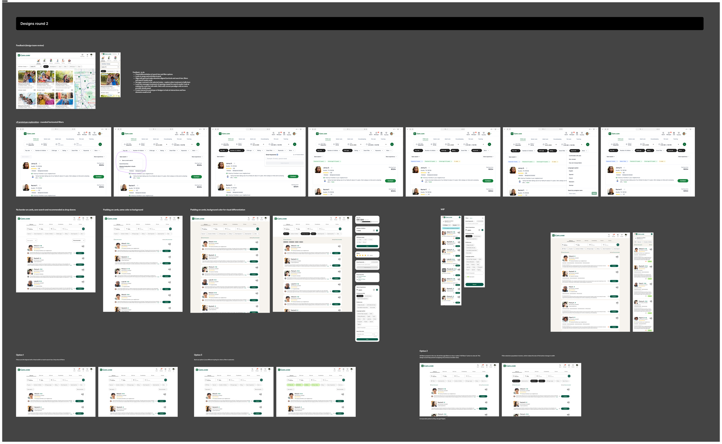
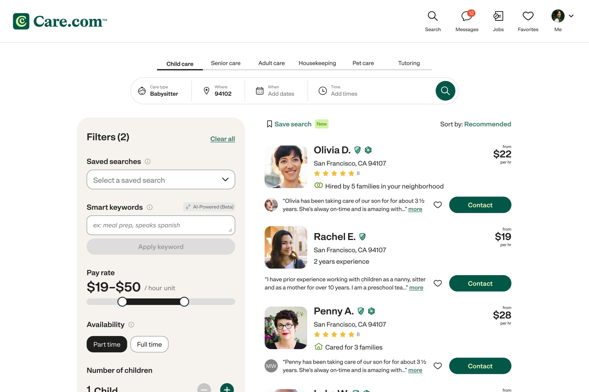
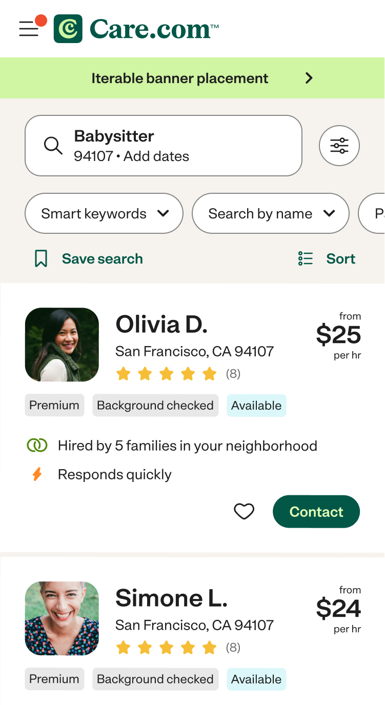
V1 Horizontal filters

The redesign significantly improved both usability and business outcomes:
+27% increase in NPS
+14 point improvement in Customer Effort Score
+10% increase in click-to-contact
By removing friction from filtering, search was easier for users to find and act on the right results.
Test results
+15% increase in click-to-contact
By keeping users anchored in context, we reduced cognitive load and made it faster to move from browsing to action.
I redesigned the filtering experience to:
Move filters to a horizontal, top-aligned pattern
Eliminate disruptive page jumps
Improve visibility and clarity of active filters
Instead of conducting user testing with mocks, I leveraged AI to build fully functional prototypes for more realistic user testing.
AI prototyping
Using Vercel, I built fully interactive prototypes that replicated real search behavior. This allowed me to test the visual design and interaction quality.
I drafted interview questions and partnered with PlaybookUX to run unmoderated studies, capturing videos of users engaging with the designs in real scenarios.
To move quickly without losing rigor, I used AI to synthesize patterns across sessions. This enabled rapid iteration cycles that would typically take months.
I then validated refined concepts with our Customer Council (real families using the platform) to ensure the experience resonated beyond usability into trust and clarity.
Impact
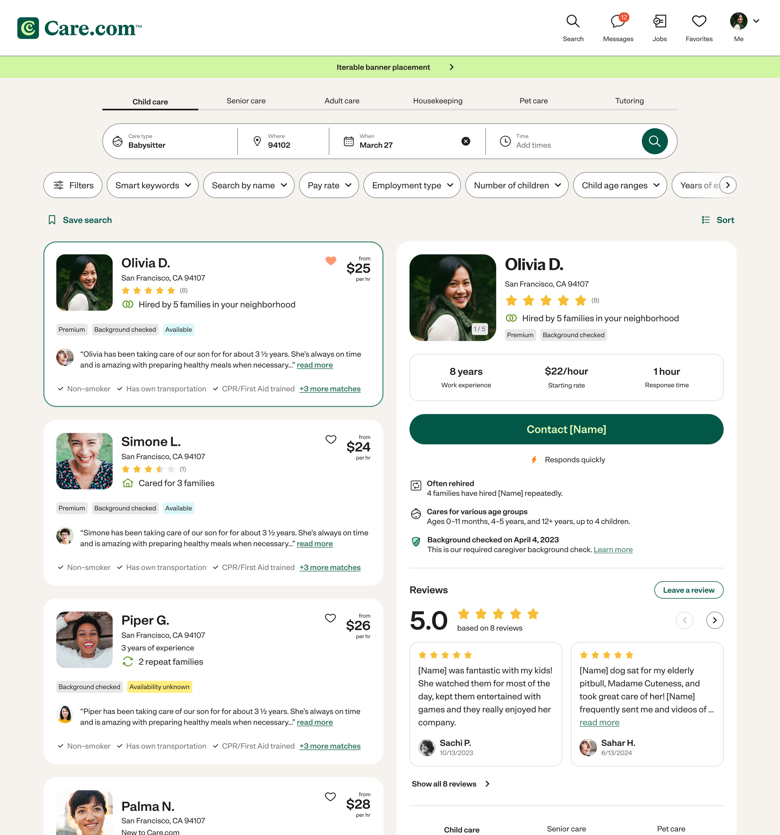
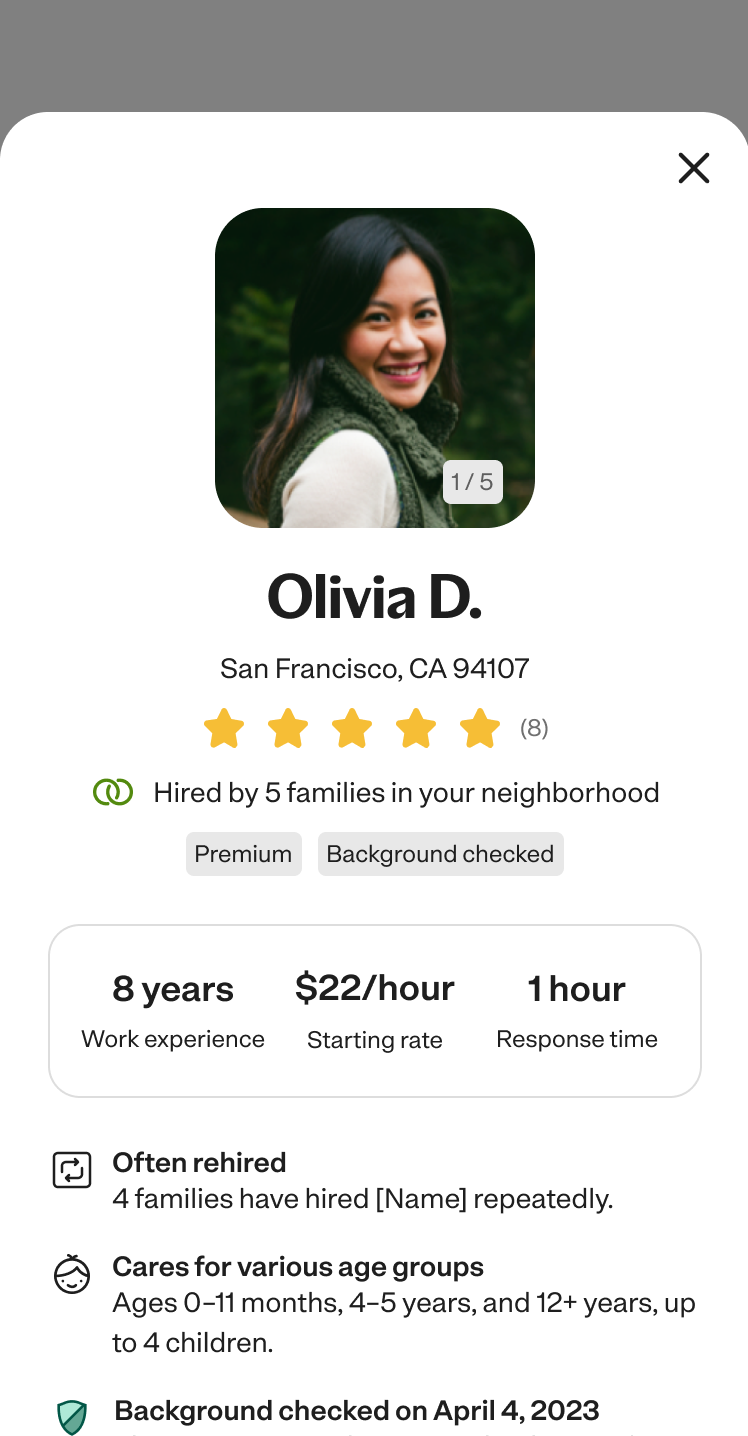
V2 Details panel
Users could now filter and find results more efficiently, but decision-making within search was still fragmented. Evaluating caregivers required repeated navigation in and out of profiles, breaking context and slowing momentum.
I led a second iteration of search focused on reducing friction in evaluation.
I introduced a side panel experience that allowed users to:
View detailed profile information alongside results
Compare options without losing context
Take action directly within search
This shifted search from a list of results to a more fluid decision making environment.
Impact
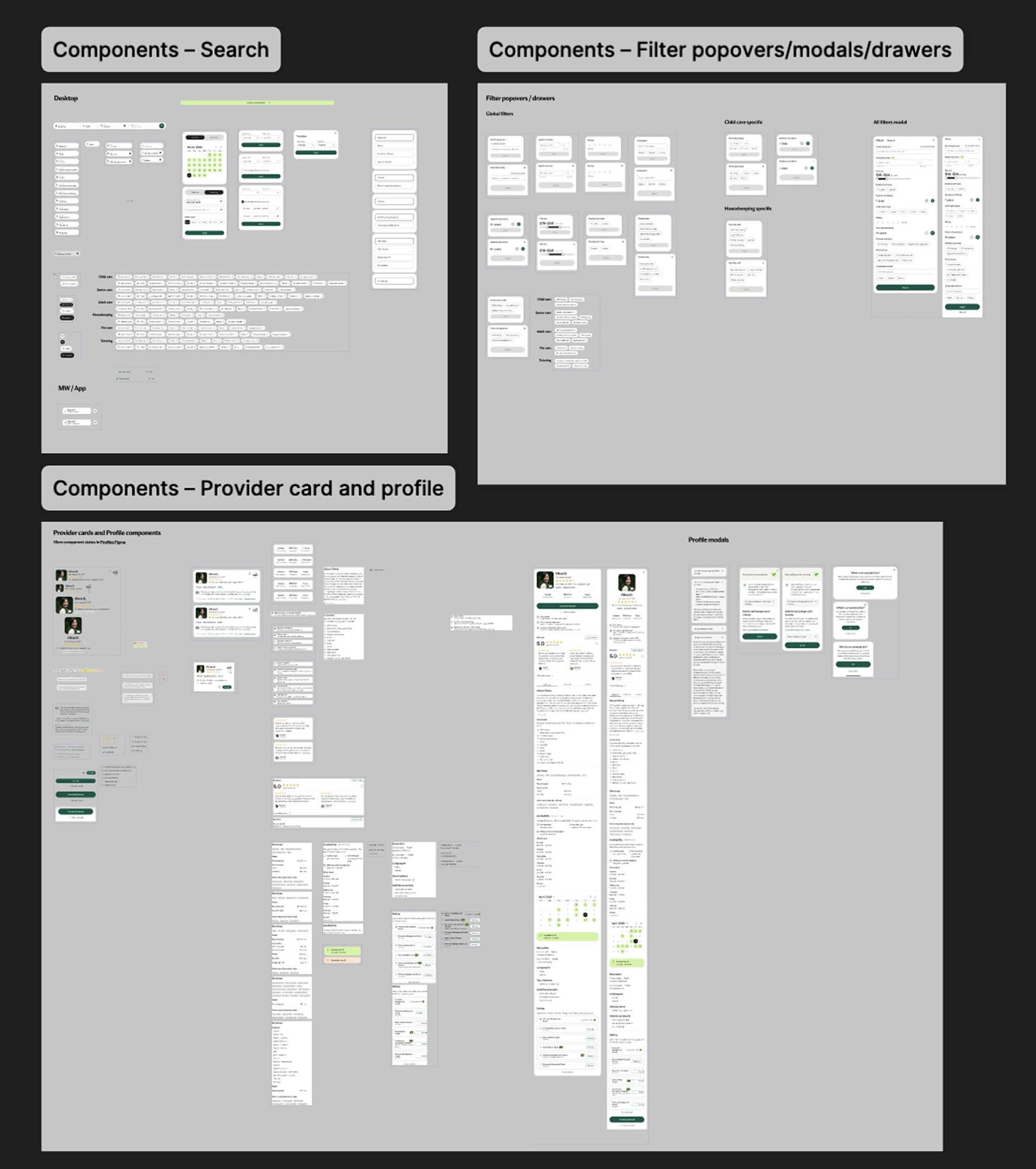
Design system contributions
I translated the redesign into reusable components, standardized filter interactions, and a scalable card structure to ensure consistency and support future growth.